概述
泰坦尼克号获救预测,分析什么样的乘客获救,什么样的乘客不能获救
数据下载
官方下载地址:
https://www.kaggle.com/c/titanic/data
百度网盘下载地址:
链接:https://pan.baidu.com/s/1ZZZJeWJWvpYGq5hki1AvyQ
提取码:8ck5
数据文件说明
train.csv和test.csv文件列说明
| 字段 | 说明 |
|---|---|
| PassengerId | 乘客编号 |
| Survival | 是否获救,0:未获救,1:已获救 |
| Pclass | 船舱等级 |
| Name | 乘客姓名 |
| Sex | 性别,male:男,female:女 |
| Age | 年龄,有丢失数据 |
| SibSp | 兄弟姐妹/配偶 |
| Parch | 父母/孩子 |
| Ticket | 船票编号 |
| Fare | 票价,跟船舱等级有关 |
| Cabin | 船舱号 |
| Embarked | 登船地点,C = Cherbourg, Q = Queenstown, S = Southampton |
读取数据
import numpy as numpy
import pandas as pd
import matplotlib.pyplot as plt
import seaborn as sns
#使用图表样式
plt.style.use('fivethirtyeight')
# 支持中文,正常显示中文标签
plt.rcParams['font.sans-serif'] = ['SimHei']

# %matplotlib inline

f=open(r'C:\Users\mym\Desktop\数据挖掘\titanic\train.csv')
data=pd.read_csv(f)
#查看前5条记录
print(data.head())
初步统计
统计null值的情况
print(data.isnull().sum())
结果如下:
[5 rows x 12 columns]
PassengerId      0
Survived         0
Pclass           0
Name             0
Sex              0
Age            177
SibSp            0
Parch            0
Ticket           0
Fare             0
Cabin          687
Embarked         2
dtype: int64
Age 有177个空值,之后要想办法回填,Cabin 有687个空值,数量太多,废弃了
最后一行dtype: int64 表示数值类型
粗略统计各列数据
print(data.describe())
结果
       PassengerId    Survived      Pclass         Age       SibSp       Parch        Fare
count   891.000000  891.000000  891.000000  714.000000  891.000000  891.000000  891.000000
mean    446.000000    0.383838    2.308642   29.699118    0.523008    0.381594   32.204208
std     257.353842    0.486592    0.836071   14.526497    1.102743    0.806057   49.693429
min       1.000000    0.000000    1.000000    0.420000    0.000000    0.000000    0.000000
25%     223.500000    0.000000    2.000000   20.125000    0.000000    0.000000    7.910400
50%     446.000000    0.000000    3.000000   28.000000    0.000000    0.000000   14.454200
75%     668.500000    1.000000    3.000000   38.000000    1.000000    0.000000   31.000000
max     891.000000    1.000000    3.000000   80.000000    8.000000    6.000000  512.329200
粗略统计只会统计数值类型,字符串类型直接过滤掉
- count:总数
- mean:平均值
- std:标准差
- min:最小值
- 25% 50% 75%:返回25%,50%,75%数据量时的数字
- max:最大值
图表展示获救情况
# 定义一行两列图表,并指定宽高,单位英寸
figure,ax=plt.subplots(1,2,figsize=(16,8))
# 设置图表总标题
figure.suptitle('获救情况')
data['Survived'].value_counts().plot.pie(explode=[0,0.1],autopct='%1.1f%%',ax=ax[0],shadow=True)
# 设置子图表标题
ax[0].set_title('获救比例')
#将子图y轴标题设置为空
ax[0].set_ylabel('')
sns.countplot('Survived',data=data,ax=ax[1])
# 设置子图表标题
ax[1].set_title('获救数量')
#将子图x轴标题设置为空
ax[1].set_xlabel('')
#将子图y轴标题设置为空
ax[1].set_ylabel('')
plt.show()
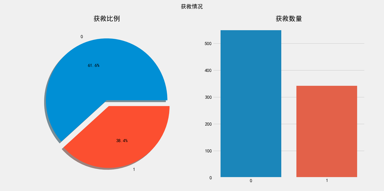
图表展示获救情况
性别和获救的关系
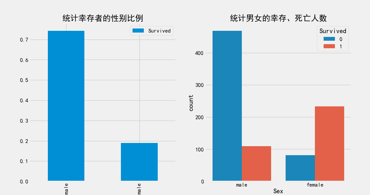
统计男女的获救、死亡人数
print('统计男女的获救、死亡人数','='*50)
r=data.groupby(['Sex','Survived'])['Survived'].count()
print(r)
结果:
Sex     Survived
female  0            81
        1           233
male    0           468
        1           109
Name: Survived, dtype: int64
统计获救者的性别比例
print('统计获救者的性别比例')
print(data[['Sex','Survived']].groupby(['Sex']).mean())
结果
        Survived
Sex
female  0.742038
male    0.188908
将上面的数字绘制成图表
# 定义一行两列图表,并指定宽高,单位英寸
figure,ax=plt.subplots(1,2,figsize=(16,8))
# 将“统计幸存者的性别比例”绘制成图表
data[['Sex','Survived']].groupby(['Sex']).mean().plot.bar(ax=ax[0])
# 设置子图表标题
ax[0].set_title('统计幸存者的性别比例')
# 将“统计男女的幸存、死亡人数”绘制成图表
sns.countplot('Sex',hue='Survived',data=data,ax=ax[1])
# 设置子图表标题
ax[1].set_title('统计男女的幸存、死亡人数')
# 显示
plt.show()