使用弹性布局
flex弹性布局样式加在 父容器 上,可以让 子元素 显示在一行上
.box{
  display: flex;
}
默认情况-不指定子元素宽度、高度

默认情况(不指定子元素宽度、高度),高度充满,宽度由内容撑起来
此时与
div相反,div是宽度100%,高度由内容撑起来
<style>
    #box{
        width: 300px;
        height: 400px;
        background-color: aquamarine;
        display: flex;
    }
    .goods{
        background-color: antiquewhite;
        border: 1px solid red;
    }
</style>
<div id="box">
    <div class="goods">1</div>
    <div class="goods">2</div>
    <div class="goods">3</div>
    <div class="goods">4</div>
</div>
指定子元素宽度、高度(且不超过父容器)

<style>
    #box{
        width: 300px;
        height: 400px;
        background-color: aquamarine;
        display: flex;
    }
    .goods{
        width: 50px;
        height: 80px;
        background-color: antiquewhite;
        border: 1px solid red;
    }
</style>
<div id="box">
    <div class="goods">1</div>
    <div class="goods">2</div>
    <div class="goods">3</div>
    <div class="goods">4</div>
</div>
指定子元素宽度、高度(且超过父容器)

父容器大小不变,各个子元素的 宽度 会 自动缩小,即:不会超过父容器,子元素的 高度会正常显示,即:超过父容器
<style>
    #box{
        width: 300px;
        height: 400px;
        background-color: aquamarine;
        display: flex;
    }
    .goods{
        width: 100px;
        height: 800px;
        background-color: antiquewhite;
        border: 1px solid red;
    }
</style>
<div id="box">
    <div class="goods">1</div>
    <div class="goods">2</div>
    <div class="goods">3</div>
    <div class="goods">4</div>
</div>
主轴 和 交叉轴
默认情况
主轴(main axis):水平的
交叉轴(cross axis):垂直的
设置 flex-direction 属性
通过设置 flex-direction 属性,将主轴设置为垂直的,交叉轴设置为水平的
flex-direction属性
flex-direction属性决定主轴的方向(即项目的排列方向)。
有4个值:
- row(默认值):主轴为水平方向,起点在左端,从左往右依次显示子元素。

- row-reverse:主轴为水平方向,起点在右端,从右往左依次显示子元素。

- column:主轴为垂直方向,起点在上方,从上往下依次显示子元素。

- column-reverse:主轴为垂直方向,起点在下方,从下往上一依次显示子元素。

例子
<style>
    #box{
        width: 300px;
        height: 400px;
        background-color: aquamarine;
        display: flex;
        /* flex-direction: row-reverse; */
        /* flex-direction: column; */
        flex-direction: column-reverse;
    }
    .goods{
        width: 50px;
        height: 80px;
        background-color: antiquewhite;
        /* margin: 5px; */
        border: 1px solid red;
    }
</style>
<div id="box">
    <div class="goods">1</div>
    <div class="goods">2</div>
    <div class="goods">3</div>
    <div class="goods">4</div>
</div>
justify-content属性
justify-content 属性定义了项目在 主轴 上的对齐方式
通常用于弹性盒模型(Flexbox)布局中,也可以用于网格(Grid)布局的行对齐
与 flex-direction 属性有关(水平主轴、垂直主轴)
当 flex-direction 是 row 时,即:主轴是水平从左向右,有以下值:
- flex-start(默认值):子元素紧挨着容器的起始边缘排列(仅适用于弹性布局)
- flex-end:子元素紧挨着容器的末尾边缘排列(适用于弹性布局)

- center: 居中

- space-between:子元素之间的间隔都相等,但两侧子元素紧挨着容器

- space-around:子元素 两侧 的 间隔 相等。所以,子元素之间的间隔,比第一个子元素到 父容器左侧的间距大一倍,同理,比最后一个子元素到 父容器右侧的间距大一倍。
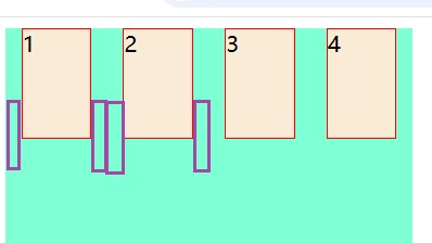
- space-evenly:所有子元素之间的 间隔相等,包括 两侧子元素到容器边缘的间隔

align-items属性
align-items属性定义项目在 交叉轴 上如何对齐
与 flex-direction 属性有关
当 flex-direction 是 row 时,即:交叉轴垂直从上到下,有以下值:
- stretch(默认值):如果项目未设置高度或设为auto,将占满整个容器的高度。

- flex-start:交叉轴的起点对齐。

- flex-end:交叉轴的终点对齐。

- center:交叉轴的中点对齐。
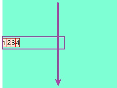
- baseline: 项目的第一行文字的基线对齐

例子
<style>
    #box{
        width: 300px;
        height: 400px;
        background-color: aquamarine;
        display: flex;
        align-items:baseline;
    }
    .goods{
        background-color: antiquewhite;
        border: 1px solid red;
    }
</style>

<div id="box">
    <div class="goods" style="height:200px;padding-top:50px;">1</div>
    <div class="goods">2</div>
    <div class="goods">3</div>
    <div class="goods">4</div>
</div>
参考:
https://www.runoob.com/w3cnote/flex-grammar.html