高清屏的缩放
在高分辨率屏幕,一般设置放大 125%,如下:

放大后的 canvas
如上图,如果高清屏放大了,canvas绘制的图形会被 放大,因此图形、文字会变得 模糊
代码
可以看出直线粗,文字不清晰:
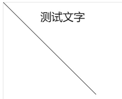
<canvas width="500" height="500" style="border: 1px solid #ccc;"></canvas>

<script>
    const canvas = document.querySelector("canvas");

    const ctx = canvas.getContext('2d');

    ctx.font = "30px '微软雅黑'";
    ctx.fillText("测试文字", 100, 50);

    ctx.moveTo(0,0)
    ctx.lineTo(250,250)
    ctx.stroke();
</script>
分析
通过:canvas宽高尺寸 可知,css 宽高属性,可以缩放 canvas,解决思路如下:
思路1:如果 canvas 设置了 宽高属性,那么就将 css宽高缩小,即:
css宽高 = canvas宽高 / 1.25思路2:如果 canvas 设置了 css宽高,那么就将 canvas 的宽高属性放大,即:
canvas的宽高属性 = css宽高 * 1.25
获取放大值
通过 window.devicePixelRatio 获取放大的比例,是 1.25。
解决
<canvas id="my-canvas" style="width:200px; height:200px;"></canvas>
将画布尺寸设置为画板尺寸的 window.devicePixelRatio 倍:
var canvas=document.getElementById('canvas');
canvas.width=canvas. clientWidth*window.devicePixelRatio;
canvas.height=canvas.clientHeight*window.devicePixelRatio;
思路1-完整代码
缩放后,线条变细了
提示:canvas中的图形的坐标,是基于 canvas 的,所以 不需要等比例缩放
<canvas style="border: 1px solid #ccc;"  width="500" height="500"  ></canvas>

<script>
    const canvas = document.querySelector("canvas");
    canvas.style.width = canvas.width / window.devicePixelRatio+"px";
    canvas.style.height = canvas.height /window.devicePixelRatio+"px";

    const ctx = canvas.getContext('2d');

    ctx.font = "30px '微软雅黑'";
    ctx.fillText("测试文字", 100, 50);

    ctx.moveTo(0 ,0 )
    ctx.lineTo(250 ,250 )
    ctx.stroke();
</script>
思路2-完整代码
缩放后,线条变细了
提示:canvas中的图形的坐标,是基于 canvas 的,所以 不需要等比例缩放
<canvas style="border: 1px solid #ccc;width:400px; height:400px;" ></canvas>

<script>
    const canvas = document.querySelector("canvas");
    canvas.width=canvas.clientWidth*window.devicePixelRatio;
    canvas.height=canvas.clientHeight*window.devicePixelRatio;
    const ctx = canvas.getContext('2d');

    ctx.font = "30px '微软雅黑'";
    ctx.fillText("测试文字", 100, 50);

    ctx.moveTo(0,0)
    ctx.lineTo(250,250)
    ctx.stroke();
</script>
注意:样式设置的 width 是的元素内容宽度,不包括内边距、边框、外边距的,而 clientWidth 包括内边距,不包括边框、外边距、滚动条的
参考:
https://segmentfault.com/a/1190000020189168