说明
如下图:
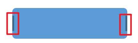
分析
父元素设置弹性布局:display: flex;
父元素设置垂直居中:align-items: center;
子元素靠右:margin-left: auto;
代码
css:
.square{
    background-color: #5b9bd5;
    /* border: 1px #969696 solid; */
    width: 300px;
    height: 80px;
    position: relative;
    top:50px; /*距离顶部的像素值,相当于y坐标*/
    left:100px; /*距离左侧的像素值,相当于x坐标*/
    border-radius: 10px;
    display: flex;
    /* justify-content: center; */
    align-items: center;
}
.square_block {
    width: 5px;
    height: 50%;
    background-color: #3c668c;
    cursor: col-resize;
}
.left{
    /* float: left; */
}
.right{
    margin-left: auto;
}
html:
<div class="square" name="square">
    <div class="square_block left" ></div>
    <div class="square_block right" ></div>
</div>
参考:
https://blog.csdn.net/ZHENGCHUNJUN/article/details/116756998